Daniel Tan of Tofu Design
With nearly 43,000 followers on Behance, Daniel Tan is a Malaysian-based designer whose work has been featured on Abduzeedo and WeLoveWebDesign. A business student, turned self-taught graphic designer, he now works as the Creative Director and Co-Founder of Tofu Design, a Malaysia-based creative studio that specializes in UI/UX and branding.
Last week, Daniel took the time to share some of his thoughts on design for this June’s “Motion” issue of The Delightfulness Project. In our conversation, he shares his approach to defining his design aesthetic, his favorite designs tools, and his proudest project to date.
A Chat with Daniel Tan of Tofu Design 💬
1. In your words, why does animation/motion matter?
Answer: I think motion has a very unspoken influence and effect on people - it makes everything more enjoyable, more captivating, and more engaging. I believe animation has the power to generate the right emotions to elevate your user’s experience without them realizing why they’re so immersed.
⤷ Daniel’s Olympic Sports Website plays with continuous animation and immersive depth to create an “explosive effect”.
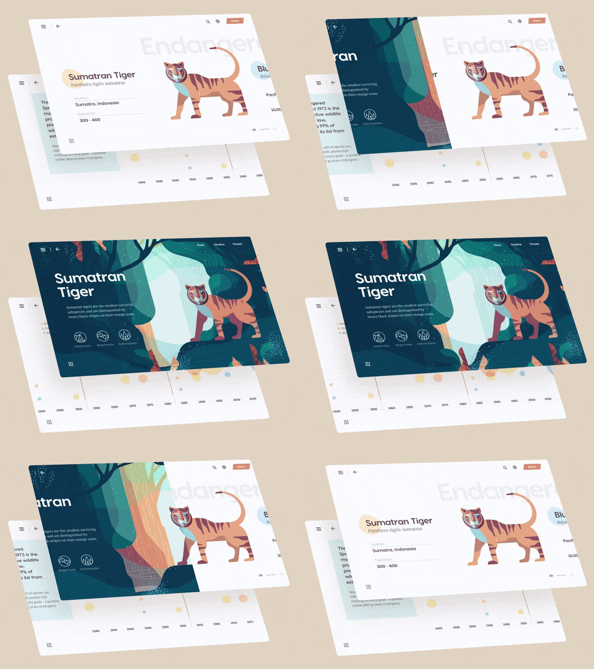
2. What I really love about your aesthetic is the bright, airy, and almost “floating” quality. Even in the animations, I notice the use of parallax (e.g. the Sumatran Tiger), page “flipping” (e.g. the Murakami project) that make users truly feel as though they’re exploring a multi-layered experience. How did you develop your personal aesthetic for interaction design and how do you balance your aesthetic when working with clients?
Answer: Thank you for saying that - I really appreciate that you noticed it because those are the exact feelings I try to achieve with my work.
Most of my aesthetic, I’d say, is derived from my everyday observation - real-life situations, and generally how things move. When I catch something that inspires me a certain way - maybe a warmth, or an excitement, etc - I attempt to capture the same feeling in my next project. From there, I will try different approaches to try to translate the feeling into an animation.
When it comes to balancing my aesthetic with client work, this is a tough one because you’re also trying to balance goals and visions from someone other than yourself. What happens in these situations is that we, as a team, have to tear down our beliefs and rebuild it based on what their needs are plus how far the client is willing to go. Then, we’ll begin to evaluate relevant areas we can inject a piece of ourselves. Could be the typography, use of white space, things like that. Client work is always very interesting because I have learnt a lot of new things which I otherwise wouldn’t - they help me see blindspots and consider new aspects in my design.
“Most of my aesthetic is derived from my everyday observation - real-life situations, and generally how things move. When I catch something that inspires me a certain way, I attempt to capture the same feeling in my next project.
”
3. Many of your recent designs feel incredibly whimsical and playful. I really enjoy the use of more organic shapes and lines in your interactions without it feeling too overwhelming. Tell me about your approach to designing a system of interactions, particularly when mixing different types of animations. How do you ensure that all the interactions will work together cohesively?
Answer: I’m glad you feel that way! When I approach to put together a system of interactions, I will usually start off with a base concept. Take the Murakami project for example: the main concept was a flipping book and from there, I will build smaller elements to support and express the same message. It’s always a struggle when you try to mix a few things into a screen but I do invest a lot of time in testing each possibility out.
⤷ Daniel’s Concept Haruki Murakami Book Author Site, inspired by the feeling of reading a Murakami book, “a sense of fantasy and openness”.
4. What is a project that you are especially proud of? Why?
Answer: The Sumatran Tiger (or more accurately named Climate & Animals: Extinction Crisis) is probably my proudest one so far. This project in particular was very challenging because I started off only knowing that I wanted to explore a horizontal parallax, not being too sure what it is going to be about. After I found a style I liked, I started to explore topics that could potentially fit together and with some discussion with my partner, Daphnie, and some research, we landed on the topic of climate crisis because it is also something we hold close to our hearts so it became even more meaningful.
This project truly expressed the feeling, emotion, and message I had in mind - it ticked all the boxes of something that hasn’t been done before while also spreading a positive message. When design has meaning while looking beautiful, it takes the experience to the next level and that’s what I always strive for.
⤷ Climate & Animals: Extinction Crisis, by Daniel Tan of Tofu Design
“When design has meaning while looking beautiful, it takes the experience to the next level, and that’s what I always strive for.
”
5. Another thing I’m inspired by is how creative and thoughtful each of your conceptual designs are. Where do you go to find inspiration? Who are your interaction design heroes?
Answer: Generally speaking, I don’t have a concrete place or person that inspires me - I like to absorb my inspiration and influences from everywhere and everything. I think that keeps my mind open. Usually, if I have an idea I want to achieve, I will search on platforms like Pinterest, Instagram, or Muzli to try and pick out elements I like and put them together.
Some notable inspirations though are Ben Marriott, Johnny Harris from Vox (the animation in his videos are really captivating), and Netflix’s Abstract’s title sequences, just to name a few. These are people and things that have left an impression on me.
⤷ Tofu Design’s delightfully “jiggly” logo & title animation | Read about how tofu inspired their design studio here
6. Can you share any favorite tools or resources?
Answer:
Adobe After Effects: It is immensely powerful and relatively easy to learn with some practice. Even with my fundamental knowledge, it is enough to achieve some cool stuff.
EaseCopy plugin for After Effects: Helps you copy your “easing curve” for all layers.
Adobe Photoshop: I prefer to use this for illustrations because I think the layers are a lot neater compared to Illustrator.
Fonts Ninja Chrome plugin: Helps you identify fonts on websites.
Pexels: Great quality stock photos and videos.
Flaticon: Resource for icons.
⤷ Daniel’s Behance Page | Another fantastic source of inspiration.
9. Last question: how can people get in touch with you? And if they do, what should they reach out to you for?
They can contact us at hello@tofudesign.co and check out our website at www.tofudesign.co.
Reach out to us for branding and UI/UX design services. We love working with progressive people and businesses with a meaningful mission - whether it’s their background story, their mission forward, or just their company philosophy.


